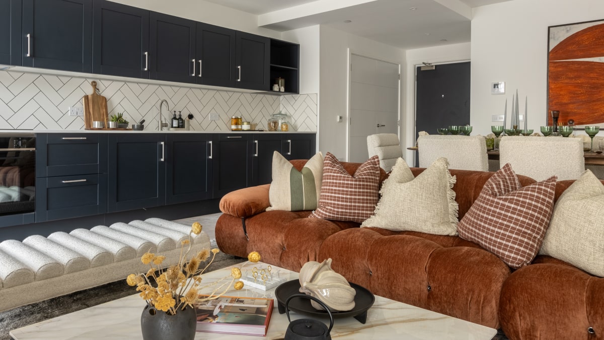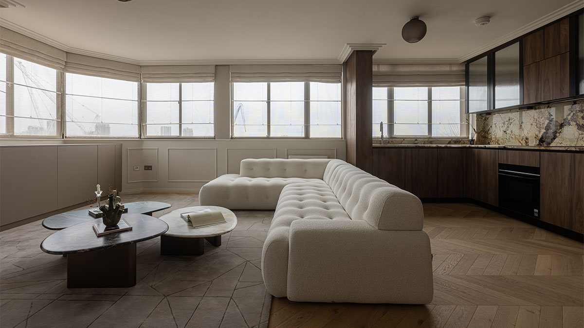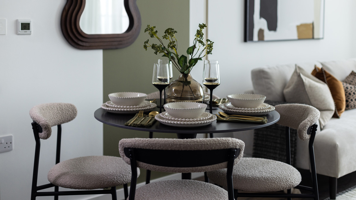
While furnishing, styling and accessorising a property can single-handedly improve rental value, for a dramatic increase, landlords of older properties often also need to carry out refurbishment work.
Read below to learn how we increased the rent of a Portfolio Landlord’s Notting Hill Gate property from £1,200 to £2,200 through clever refurbishment paired with thoughtful furnishing.
What Was the Client’s Main Goal?
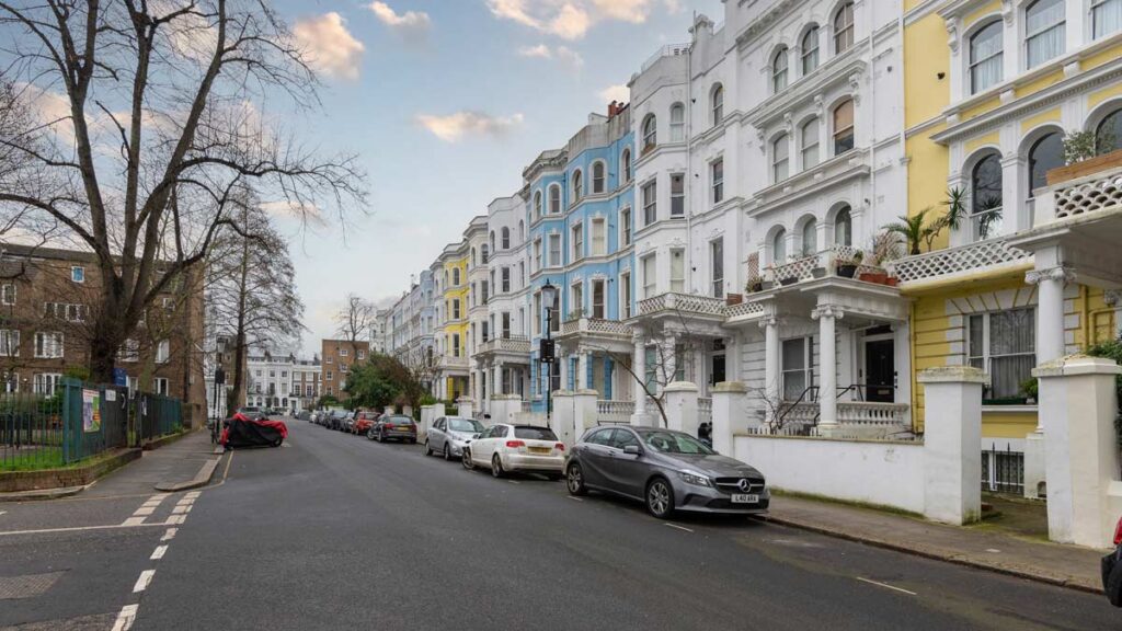
The client wanted to secure an instant tenant at a much higher rental value given the desirable W11 postcode.
As specialists at increasing rental yields, we informed the portfolio landlord that refurbishment work was therefore essential in order to make better use of the property’s generous square footage and potential height and natural light.
How Did You Ensure a Good ROI?
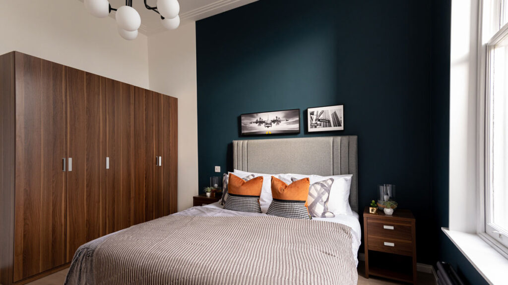
InStyle Direct generates careful budget plans before work begins to ensure that work performed will generate a return on investment. After the client approved the costs, we got to work straight away and ensured that we did not go a penny over the agreed costs.
Which Changes Achieved the Most Drastic Results?
1. Removing the Lower Ceiling
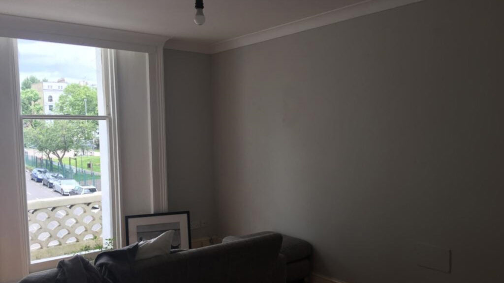
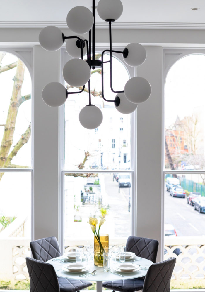
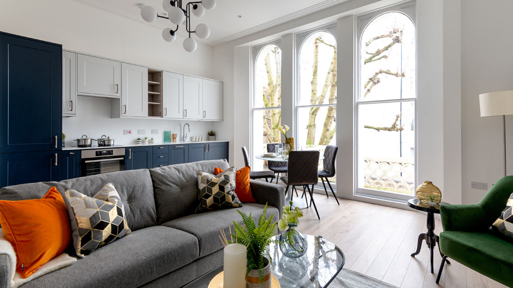
We removed the existing 1-metre ceiling to expose additional height and large, stucco statement windows that introduced masses of natural light. Additionally, this provided the illusion of far more space. It also allowed for statement pendant lights that can be seen from the outside of the property for refined kerb appeal.
2. An Open-plan Layout
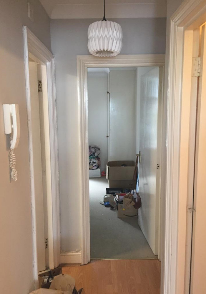
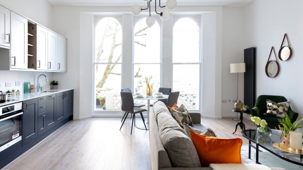
We removed all of the walls for a desirable open-plan layout that fully utilises the property’s generous square footage and provided an impressive, open entrance with a wow factor that instantly won over prospective renters.
3. A Repositioned Kitchen
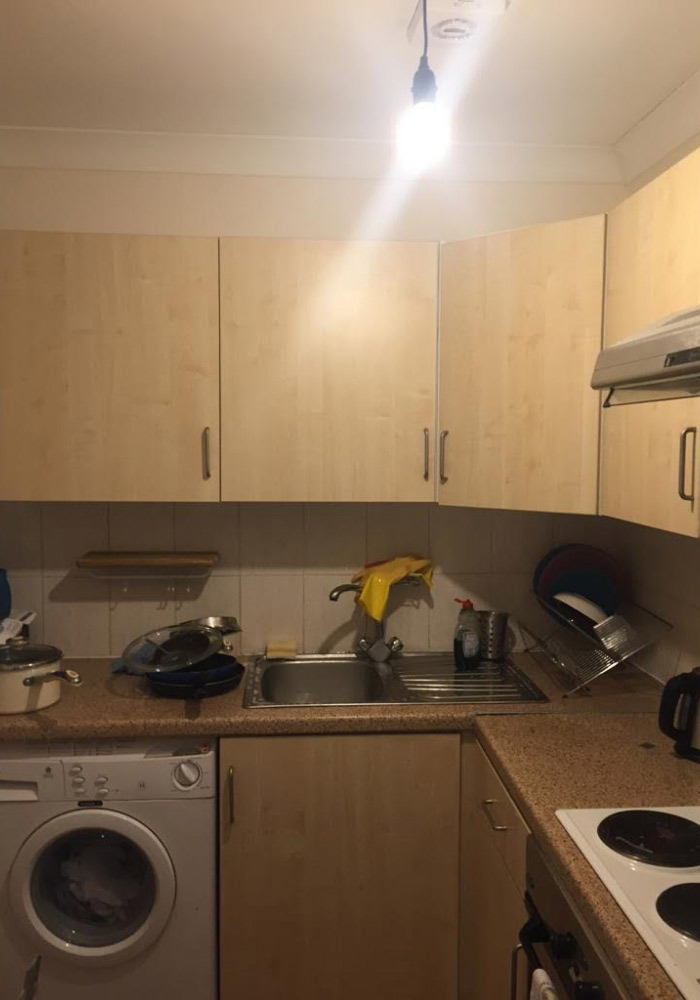
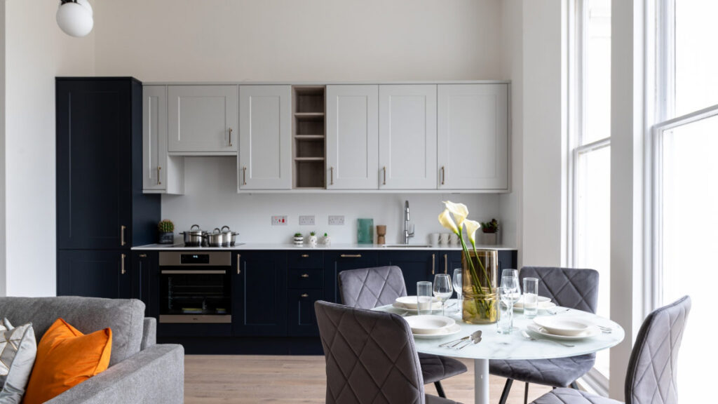
The kitchen was previously located in a small room upon entry. This room was entirely knocked through and a larger kitchen was introduced to the spacious, open-plan area.
4. A Work from Home Area
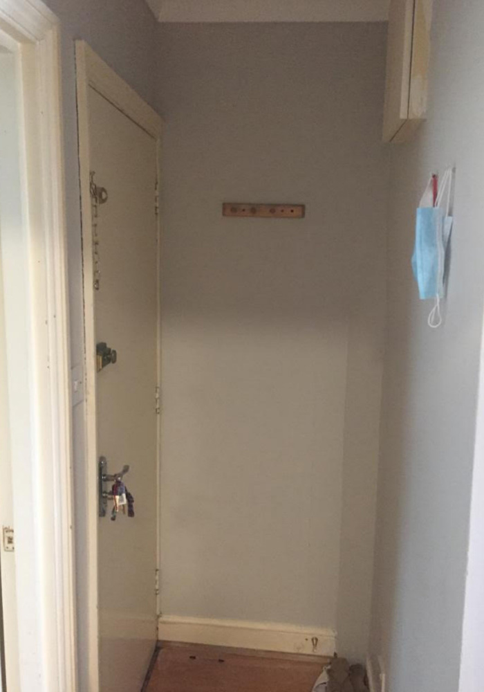
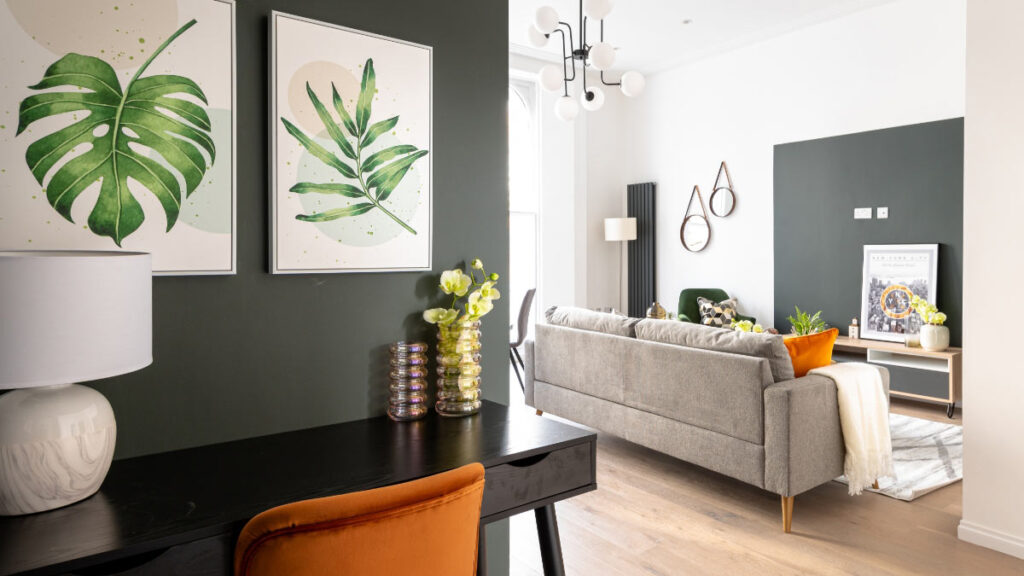
A dedicated, working-from-home space is now on the wish list of most prospective renters. We added a desk at the entrance where the old kitchen was to utilise the floor plan while keeping it spacious and welcoming.
What Design Element Won Over the Viewers?
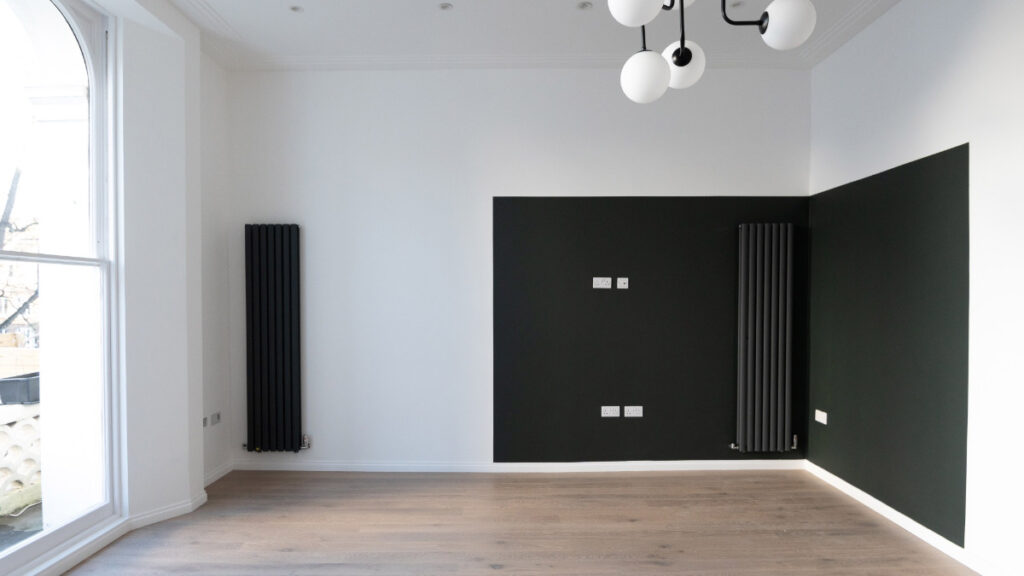
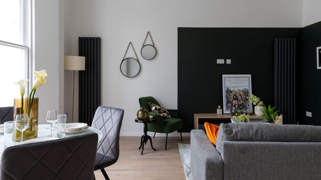
Aside from the clear benefits of the renovation, the Portobello Road Market-inspired decor appealed to the target audience. Potential tenants complimented the design, confirming its allure in comparison to other properties in the area that they’d viewed. Almost doubling the monthly rent, this success story proves the power of clever, considerate refurbishment and appropriate furnishing and styling.
Watch the YouTube video below for a full tour of the furnished property.

